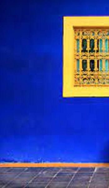
Last year we visited Morocco. And of course, one of the highlights of the Marrakesh stay was a visit to the Jardins Majorelle. It is named after the person who created it–Jacques Majorelle, a famous French furniture designer who fell in love with Morocco in general and Marrakesh in particular, and spent most of his life there. He was inspired by the colours and designs of the country. He bought land on the outskirts, and commissioned a Cubist Villa to be built there, which he painted in a particular shade of blue which he developed inspired by the blue tiles widely used in that part of the country. The colour now carries his name, and is trademarked as Majorelle Blue. And as an afterthought, it is also called Moroccan Blue! (I wonder if Marrakesh craftspeople and tile makers whose ancestors must have developed the colour get any benefit from the use of the trademark?!?)
Another artist who added his name to blue was Yves Klein. Over ten years starting 1947, he created what is referred to as the purest blue. This ultramarine blue is called International Klein Blue.
There is something special about blue. It is invariably voted the most popular colour in American and European polls. It is an ancient colour, associated with the Gods (in India, Krishna and Rama are blue, and Shiva’s throat is blue), and with royalty in many parts of the world. But in many languages, it is one of the last colours to be named! Which seems strange, considering the sky and the seas are some of the vastest expanses human eyes see.
Blue is associated with feelings of calmness and relaxation, as well as stability and reliability. Of course, it is also associated with sadness, which is why we talk about ‘feeling blue.’ Offices are often done up in blue because research has shown that people are more productive and creative when working in blue rooms. In branding and advertising, blue is often used to market products and services which are associated with hygiene(sanitizers and disinfectants), air and sky (airlines and airports), water and sea (cruises, mineral water).
But it is supposed to be a very unappetizing colour! Blue is the least common one amongst the foods we eat. It is said to suppress the appetite, and some diets even recommend eating off blue plates when you are trying to reduce your food intake.
Blue is also a fairly uncommon colour in nature–even the few animals and plants that appear blue don’t actually contain the colour!.
In ancient times, this was one of the most expensive colours to produce, which is why only the royalty and the rich wore it. In India however, it has been in use for over 5000 years, thanks the blue dye derived from the Indigofera Tinctoria (Indigo). Our Indus Valley ancestors dyed their clothes with this.
This has also been one of the most costly pigments for painters and hence the colour was used only for important subjects. During the Renaissance, the Virgin Mary was the most important subject painted and most art from that time shows her wearing blue.
In pottery however, it has been a mainstay for centuries. Samples of pottery decorated with blue glazes going back to the ninth century are thought to have originated in Iran, developed by craftsmen of Basra. From here, it spread to China, where blue and white decoration was widely used in Chinese porcelain starting from the 14th century. All these glazes used cobalt to give the blue colour.
From here blue pottery spread to Europe, specially the Delft in the Netherlands. And of course, our very own Jaipur pottery is popular too.
Think blue, think calm! Eat off blue, stay thin!
–Meena
And see https://wordpress.com/post/millennialmatriarchs.com/1288
