Though the term ‘calligraphy’ is Greek for ‘beautiful writing’, as the art form evolved, the word has taken on a larger meaning.
Today, people think of calligraphy as:
‘… the art of forming beautiful symbols by hand and arranging them well.’
or
‘…a set of skills and techniques for positioning and inscribing words so they show integrity, harmony, some sort of ancestry, rhythm and creative fire.’
Calligraphers don’t like you to equate the form to ornamental decorated letters or to the use of letters as ornaments, insisting it is about symbols themselves being beautifully formed and arranged.
They say at some level, it is not handwriting at all, because the primary goals of handwriting are to be quickly and easily written and accurately read. In fact, beauty, personality and artistic impact are nowhere near as important in handwriting as clarity and speed (I wish someone had told my primary school teachers that!).
Calligraphy, they say, is ‘writing as an art form’ and not ‘artistic-looking handwriting’. So while handwriting aims to be read, calligraphy aims to produce an ‘art’ reaction.
Calligraphy is ‘a skill which involves touch, pressure, hand movement, unity, and that elusive quality we term “beauty.’ (V. Studley).
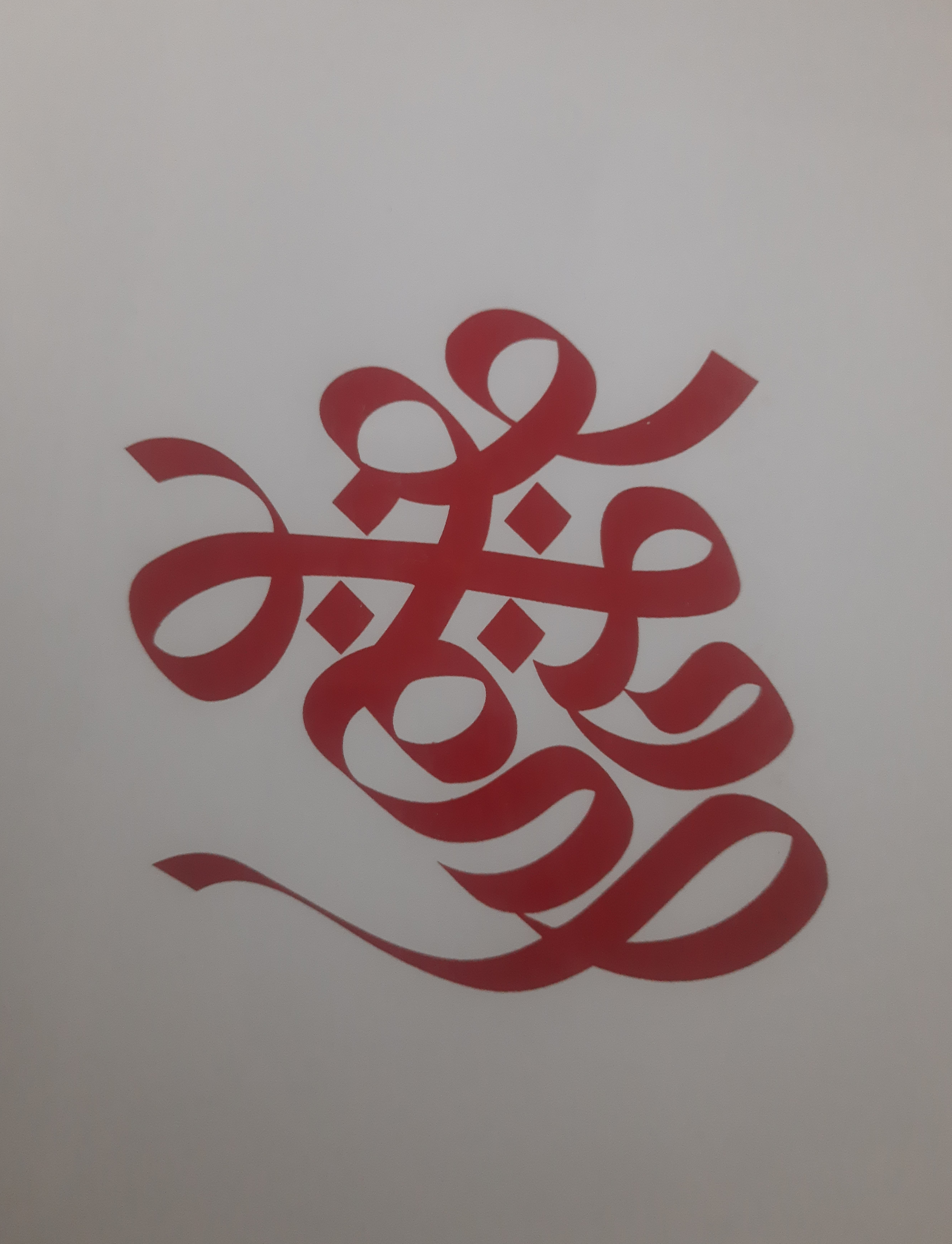
The art originated in ancient China, where characters were initially carved onto materials like animal bones and tortoise shells. Over time, this practice evolved into using ink brushes and writing on paper. From China, it moved to neighbouring countries, and slowly Westwards. The ancient Romans used reed or quill pens dipped in ink to write on long rolls of paper, while Christian churches later adopted western calligraphy to reproduce Biblical texts. Arabic calligraphy based on Arabic letters is also very well-developed, and an important part of art and architecture.
The tools used in calligraphy are all-important. While initially, the Chinese artists used ink brushes, the Romans started using reed or quill pens. Calligraphy was revolutionized with the invention of the steel nib. Different types of steel nibs—e.g., those with pointed tips and those with flat, broad edges being used for different calligraphy styles.
Calligrapher PP Raju’s work–both spiritual and meditative
The symbol of Indian Rupee adopted in 2010 is a great example of calligraphy. The symbol is an amalgam of Devanagari “Ra” and the Roman Capital “R”. It was conceptualised and designed by Udaya Kumar, an alumnus of the IDC School of Design of IIT Bombay.
The reason for this meander down calligraphy-lane is because only last week, Kochi hosted the second edition of the International Calligraphy Festival of Kerala (ICFK). The festival was organized by the Kerala Lalitha Kala Academy and the Thiruvananthapuram-based Kachatathapa Foundation, which is led by renowned calligraphy artist Narayana Bhattathiri. It brought together calligraphers from South Korea, France and Vietnam with Indian calligraphy experts like Achyut Palav, often referred to as the patriarch of Indian calligraphy, and D. Udaya Kumar, the creator of the Indian Rupee symbol. It was a priceless learning opportunity for students, teachers, advertising artists, art lovers and art enthusiasts from fine arts colleges, design institutes and design colleges in Kerala.
Apart from lectures, demonstrations and discussions on the subject, there were a range of activities including workshops, live demonstrations, an international calligraphy exhibition, and calligraphy quizzes.
What a beautiful event that must have been, for as someone said ‘Calligraphy is a kind of music not for the ears, but for the eyes.’
–Meena
