For many of us who grew up reading international newspapers, Gallup was a familiar name—almost a synonym for “what America thinks.” Their polls were quoted in classrooms, editorials, speeches, and policy discussions. If Gallup said Americans trusted an institution, or were worried about unemployment, or supported a policy, it felt as if a nation had spoken.
November 19 marked the anniversery of the birth of the man who started it all–George Gallup, a career journalist. His interest in politics led him into the areana of forecasting polls, and he set up a company to do this. He set up the American Institute of Public Opinion in 1935 to do this, at a time when the idea of systematically measuring public opinion was almost revolutionary.
Gallup polls represent a methodology of scientific polling initiated by George S. Gallup in the 1930s, aimed at accurately assessing public sentiment. This was a significant departure from earlier, less systematic polling methods, as it emphasized the importance of selecting representative samples of the population. Gallup polls gained widespread recognition in 1936 for successfully predicting Franklin D. Roosevelt’s election victory but faced criticism in 1948 when they incorrectly forecasted Harry S. Truman’s defeat. These setbacks led to learnings, and Gallup refined his polling techniques, employing random sampling and continuous polling to enhance accuracy, particularly in presidential elections during the 1950s.
When Gallup moved to random sampling in the 1950s and began polling continuously until the eve of elections, he wasn’t chasing precision for its own sake. He recognised a deeper truth: societies shift quietly, between headlines. Polls must therefore be reliable mirrors, not hurried sketches.
Over the years, Gallup polls have become integral to political campaigns, influencing candidate nominations and public policy discussions. They have also mirrored societal changes, capturing evolving attitudes on issues such as gender equality and civil rights. Despite their utility, there is ongoing debate about the reliance on polling data by political leaders, with critics cautioning against using polls as the sole measure of success. Overall, Gallup polls continue to play a vital role in understanding public opinion and shaping political discourse.
But over the past twenty years, America has changed dramatically. People stopped answering landlines. Survey participation dropped. Voter behaviour became harder to predict. And suddenly, the organisation that once defined polling found itself struggling to keep pace with a shifting landscape.
There were headline moments—for example, missing the mark in the 2012 US presidential election—that forced painful introspection. To their credit, Gallup did omething rare: they hit pause. They stepped back from national election polling, admitted where methods were no longer working, and began a long process of rebuilding.
Today, Gallup occupies a different—but still significant—place in American public life.
They no longer dominate political horse-race coverage the way they once did. But they have pivoted towards areas where long-term, stable measurement matters more:
- Public trust in institutions
- Wellbeing and life evaluation
- Workplace engagement
- Social attitudes that evolve over years, not election cycles
Their “State of the American Workplace” and “Global Emotions Report” are now widely cited, not for predicting results, but for revealing how people feel about their lives and work. In a country where political noise can drown out quieter realities, Gallup’s longitudinal datasets offer something precious: continuity.
And that, perhaps, is Gallup’s place today. Not the sole voice of American opinion, but a steady, methodical listener in a crowded room.
And Then Comes the Indian Question…
All this inevitably leads to a Indian doubt: Do we do anything like this?
India is a nation where elections are larger than many countries, where tea stall debates spill into WhatsApp forwards, and where “sentiment” is often declared loudly—but loosely. So who is actually listening methodically?
The answer is both reassuring and sobering.
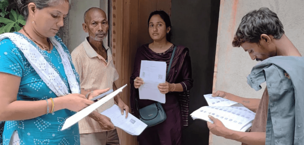
Yes, India does have organisations that follow rigorous polling practices—most famously CSDS-Lokniti, which uses sampling frames, stratified selection, field-tested questionnaires, and detailed post-poll analysis. Some private agencies also attempt scientific sampling, though with varying transparency. But polling in India faces unique challenges: population size, linguistic diversity, urban-rural divides, accessibility, and the sheer logistics of reaching voices beyond the easily reachable.
The result? While we do have pockets of high-quality research, we also have a landscape crowded with “quick polls,” “mood trackers,” and “snap surveys” whose methodology, if printed, might fit on the back of a bus ticket. Till today, election forecasts have minimum credibility.
Let’s see if all the bad press drives election forecasters to move towards more statistically sound and scientifically based approaches. Well, we can hope!
–Meena
Pic from: The India Forum
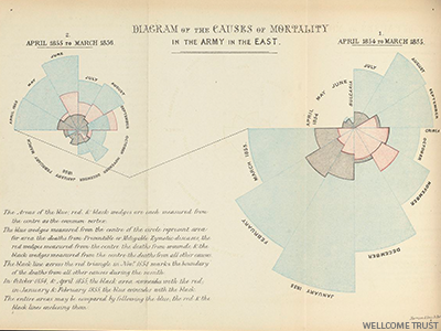 Florence was also one who shook up systems and brought in systemic changes. She battled with entrenched bureaucracies most of her working life, in order to bring about these changes. She was aware that it would be difficult to convince decision makers of the need for change, and maybe out of this requirement was born what is today counted as her major contribution to statistics—the first infographics ever made. The best-known of the infographics she invented are what are called the “coxcomb” diagrams, understandable by even the public. ‘The coxcomb is similar to a pie chart, but more intricate. In a pie chart the size of the ‘slices’ represent a proportion of data, while in a coxcomb the length which the slice extends radially from the center-point, represents the first layer of data. The specific organization of Nightingale’s chart allowed her to represent more complex information layered in a single space. In her coxcomb during the Crimean War, the chart was divided evenly into 12 slices representing months of the year, with the shaded area of each month’s slice proportional to the death rate that month. Her color-coding shading indicated the cause of death in each area of the diagram.’*