Continuing in the spirit of the Olympics—after all, they will come back only after four years—today I thought we could take a random walk through things other than the mascot which symbolize the Games.
The Olympic Rings of course are the most widely recognizable symbol of the Games. The five interlaced rings are of equal size, and are in five colours–from left to right: blue, yellow, black, green and red. The five rings stand for the five continents. One or more of the five colours is present in the flag of every country. The Olympic rings appeared for the first time as a graphic symbol for the Olympic Games in Antwerp 1920.
As per the Olympic Charter, The Olympic symbol expresses the activity of the Olympic Movement and represents the union of the five continents and the meeting of athletes from throughout the world at the Olympic Games.
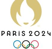
Each edition of the Games has its own emblem, which integrates the five rings. These usually combine an edition-specific characteristic symbol, lettering naming the event location and year, and of course the Olympic rings.
Another strong identity of the Games is the motto or slogan. The original motto Citius, Altius, Fortius (Faster-Higher-Stronger) was modified in 2021 to Citius, Altius, Fortius–Communiter (Faster, Higher, Stronger—Together). The Games’ motto or slogan is an integrating part of the emblem and is to be used only in the in the context of the Games. The motto is to be displayed, as far as possible, together with the Games emblem. Apart from this, individual Games may have their own taglines—the one for Paris being Games Wide Open.
Apart from these, each Olympics has a ‘Look’. This is the visual identity of that edition of the Games, and tries to capture the zeitgeist of the Games, differentiating one edition from another. It is designed to promote the culture of the host country and celebrates the spirit of its people. The Look is displayed on sporting and non-sporting facilities, the city, uniforms, tickets, credentials, products, shops, medals, etc., giving a unique identity to wherever the Games are happening. The Look of the Paris Games has been designed to celebrate sport and the festive atmosphere of the Games. It has French sense of style and elegance. The major colours are blue, red, green and purple.
Olympic Pictograms or icons are stylised, non-verbal representations or instructions that help people to find their way and provide information, even if those people cannot read the language. Since athletes come from all corners of the world, there is need for commonly understood signs. Olympic sport pictograms help with their simple, unambiguous representation of athletes, typical poses and/or sports equipment, and have been a key element of all Olympic Games. The Paris Olympics have 62 pictograms for the various events in the Olympics and Paralympics, which ‘symbolise not only the different sports, but also pride, values, and a large and diverse family’.
The Games also have an anthem. A Greek anthem was created for the 1896 Games but was not, at that stage, adopted as the official all-time anthem. For several editions of the Games, there were different anthems. However, in 1960, the original Olympic anthem with lyrics by Palamas and music by Samaras was adopted as the Olympics anthem. Appropriately, it speaks of achievement and of beauty, of greatness and of truth. Again, there is a theme song for the different Games, with the one for Paris being Parade, composed by Vector le Manse.
The Paris Olympics have seen plenty of controversies, mess-ups and disappointments, as well as moments of joy, splendour, camaraderie and achievement.
2028 will see Los Angles hosting the Games.
Well, what to say but “Faster, Higher, Stronger–Together”!
–Meena