This is the time of year to look back upon the months gone by, of the highlights and the nadirs that marked the passage of time. Of the many exercises that have become a regular part of this stock-taking is the announcement of the Words of the Year by different dictionaries. Meena has just described the history, as well as the process for this selection.
There is another announcement that is perhaps not as much noticed. That is the one of the Colour of the Year. This selection is not the outcome of as long, and oftentimes, as participatory a process that the different dictionaries undertake prior to the announcement of the Word of the Year; and perhaps its history does not date as far back. The Colour of the Year is declared by the Pantone Company which is best known for its Pantone Matching System (PMS). This is a colour order system used in a variety of industries including graphic design fashion design product design and printing. Today Pantone has become the worldwide standard for selecting communicating and matching colours.
Pantone began as a commercial printing company of the Levine brothers, two advertising executives in 1950, in New Jersey. In 1956 the Levine brothers hired Lawrence Herbert who used his knowledge of chemistry to systematically order and simplify the company’s stock of pigments and production of coloured inks. By 1962, Herbert was running the ink and printing division, and was able to buy out the original owners. He renamed the company Pantone which was a combination of the words Pan (meanng All) and Tone (meaning colour).
The company’s primary products include the Pantone Guides, which consist of a large number of small (approximately 6×2 inches or 15×5 cm) cardboard or plastic sheets, printed on one side with a series of related swatches of colours in different shades and tones. Pantone colours are described by their allocated number (For example, PMS 130). The samples are bound into a deck that opens out into a fan.
The idea behind the PMS is to allow designers to “colour match” specific colours when a design enters production stage, regardless of the equipment used to produce the colour. This system has been widely adopted by graphic designers and reproduction and printing houses. The standardization of colours is very helpful because different manufacturers in different locations can all refer to the Pantone system to make sure colours match.
The idea of declaring a Colour of the Year was initiated by the Pantone Colour Institute in 1999 as a way to mark the entry into a new millennium, and in keeping with Pantone’s belief that colour “has always been an integral part of how a culture expresses the attitudes and emotions of the times”.
The colour selected each year was envisaged as one that captured a moment in time, tapped into collective values, and heralded the year ahead. It was also meant to reflect people’s changing attitudes and aspirations. Thus it is not randomly selected but an outcome of research that finds its way into discussions by representatives from various nation’s colour standards groups. These are at secret meetings hosted twice a year by Pantone in a European capital. The colours are chosen after two days of deliberations. With a database of thousands of colours at their fingertips, Pantone’s challenge is to narrow down a colour family and explore within it to find a hue that best expresses a widespread feeling. As the company says “We don’t simply come up with our thoughts about it; we look into our research and see what people are telling us they’re looking for.” The results of the meeting are published in Pantone View, which fashion designers, florists, and many other consumer-oriented companies purchase to help guide their designs and planning for future products.
Pantone’s Colour of the year 2024 was Peach Fuzz which was described as a light, delicate shade between pink and orange. The soft hue expresses the desire to nurture kindness, compassion, and connection. All of this helps foster a peaceful future and everlasting cosiness.
In 2024 more than ever before the world needed to be reminded of these qualities which alas were sadly lacking.
However continuing its hopeful optimism Pantone has just announced its colour for the Year 2025. It is a shade of brown that is called Mocha Mousse which, as the company reminds us, is all about thoughtful indulgence. The warm shade reflects a desire for nourishment in every facet of our lives, especially through simple pleasures like morning coffee, a chocolate treat, or taking a walk. And it’s not solely about treating ourselves but also the possibility of sharing those sweet moments with others.
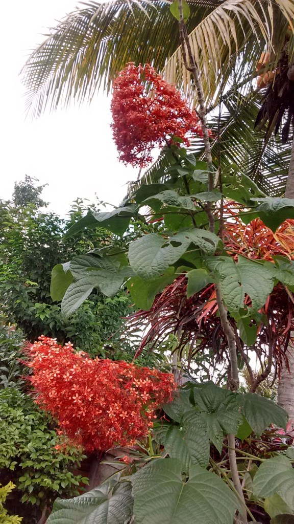
While fashion designers and architects play around with the colours of the year, for every one of us, Nature is the best reminder that every colour has its own shade and season. All we need to do is look around and marvel at its unmatchable palette.
And who better to remind us of this than the gentle author Ruskin Bond.
The Colours of Life are Everywhere
Colours are everywhere,
Bright blue the sky,
Dark green the forest,
And light the fresh grass;
Bright yellow the lights
From a train sweeping past,
The flame tree glow
At this time of year,
The mangoes burn bright
As the monsoon draws near.
A favourite colour of mine
Is the pink of the candy-floss man
As he comes down the dusty road,
Calling his wares;
And the balloon-man soon follows,
Selling his floating bright colours.
It’s early summer
And the roses blush
In the dew-drenched dawn,
And poppies sway red and white
In the invisible breeze.
Only the wind has no colour;
But if you look carefully
You will see it teasing
The colour out of the leaves.
And the rain has no colour
But it turns the bronzed grass
To emerald green,
And gives a golden sheen
To the drenched sunflower.
Look for the colours of life –
They are everywhere,
Even in your dreams.
–Mamata
